Bonnie at Pixel Dust Photo’s challenge this week is: any piece of art from a photo or an abstract piece, Oh how I wish I wasn’t given a choice, Sometimes I drive myself nuts with indecision.
This is a golden coloured metal spiders web at 25% opacity, a pale pink carnation with the opacity at 50%, Kim Klassen’s Cherish texture at 35% web and Bonnie’s Linen Blind texture at soft light.
or
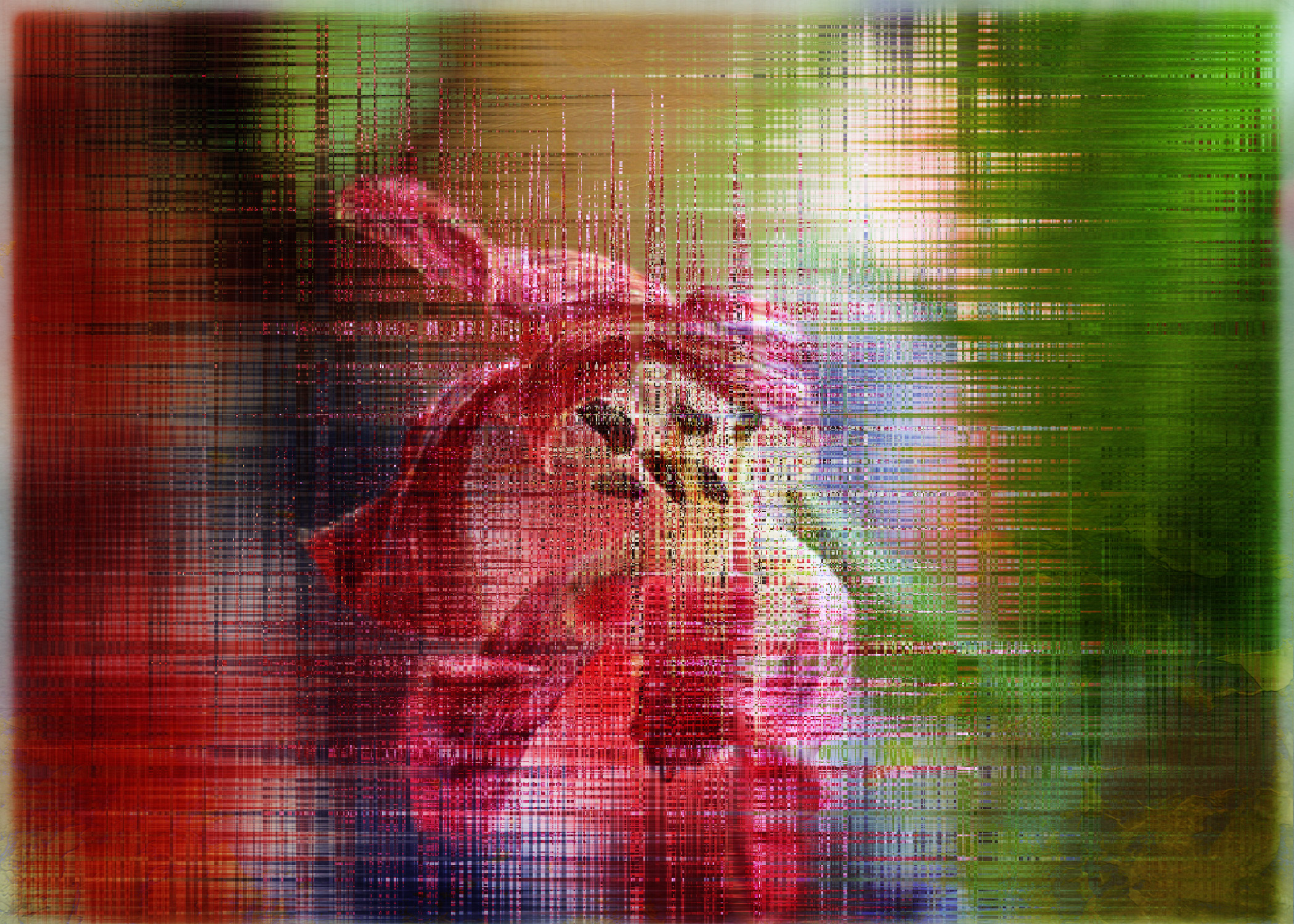
The last day of some dark pink tulips and the wave filter with it’s settings tweaked endlessly and Bonnie’s Splash of Gold beautiful texture, at soft light.
It’s Friday, I’m on leave now for a week and it’s Photo Art Friday. I have chosen not to choose. x

Hope you have a lovely weekend, don’t forget Sians Story Telling Sunday is on Sunday


Thank you 🙂 Hope you have a nice weekend Miriam!
Miriam, your images don’t appear on your blog. I did discover that if I click on those double lines, the image appears. What different artwork you have made – love them both. The first is so delicate and soft and the second is powerful and vibrant! Yes, why choose when you can try everything!!! Thanks for sharing with PAF.
Two wonderful photos. I especially like the linen look on the second one!
Like you, I get caught up in the endless possibilities and I couldn’t choose this week either. I like how the spiderweb radiates out from the flower (wouldn’t have guessed it was a web, good job!) and the abstract is so intriguing with the play of color separating but meeting in the center. Was it the wave that gave that almost plaid striping? That looks great!
Miriam so nice to “meet” you! I love what you have done here with these images! Just gorgeous. Think perhaps the first is my favorite, because it reminds me more of spring which I am so ready for! Blessings to you, and don’t forget to check back on my blogpost on march 15th to see if it is you in the winner’s circle to win these great textures of Bonnies! Look forward to seeing more of your work!
Beautiful!
Regards and best wishes
These are both great – Had to follow Bonnie’s instruction to view though as the photo’s do not appear in your post.
I love the soft feel of the first one and the use of the Spiderweb photo was genius.
Your 2nd is also nice, very vibrant.
Both are appealing and fun, Miriam! Nice job! Enjoy your week!
LOVE the first one; so soft and lovely.
Yes, the first one is just so soft and lovely! Having so many choices makes things more difficult if you ask me! Enjoy your weekend.
i love both these images! lovely! have a great weekend! 🙂
I love the soft, delicate look of the first one.
I really like both Miriam. I know what you mean about endless tweaking! I’m guilty of it myself.
These two are so different, but I love them both!
Hello, I haven’t been here before – I just dropped in from Sian’s Storytelling Sunday, then thought I’d hang around a bit.
I like those two photos – though I had to click on some funny lines above the text, in order to see them on the screen, for some reason the pictures are not displaying. It’s great when people experiment with their photos and come up with such lovely art! My favourite is the pink carnation, but I do like the zinginess of the tulips one!
Two totally different looks, both sensational. I never tire of flowers, so I love the top image. I like the linear effect you got on the bottom image.