An eight week Course with Cheryl McCain Photography.
Week One
I spent ages this afternoon setting up my light box and lights, it was dark outside by the time I finished!
I found this assignment really difficult to do. I don’t feel confident with setting up a still life to photograph and I didn’t like any of the backgrounds I chose. In the end instead of feeling inspired and frugal I felt tired and frustrated!
Any how as I want to learn here are my first attempts at still life.
This is nearly my original (and only) idea.
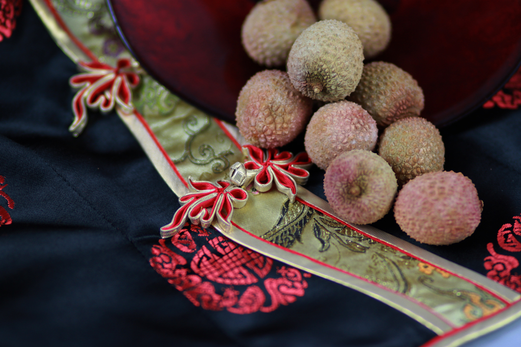
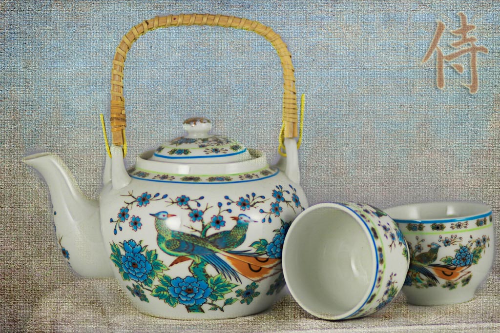
The Chinese fabric reminded me I had this Japanese patterned teapot and cups, they were my mothers.
I didn’t like any of the backgrounds I had so I made this one with a texture from Bonnie at Pixel Dust Photo Art.
As it was almost six o’clock I thought of this. The background is the black plastic fabric that came with the light box but I didn’t like it so I smudged it in Photoshop.
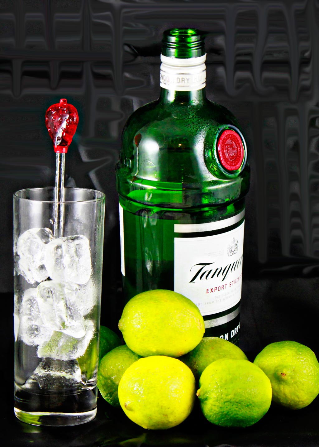
I had cleared out the drawer with the tea towels in as suggested by Barbara in this post.
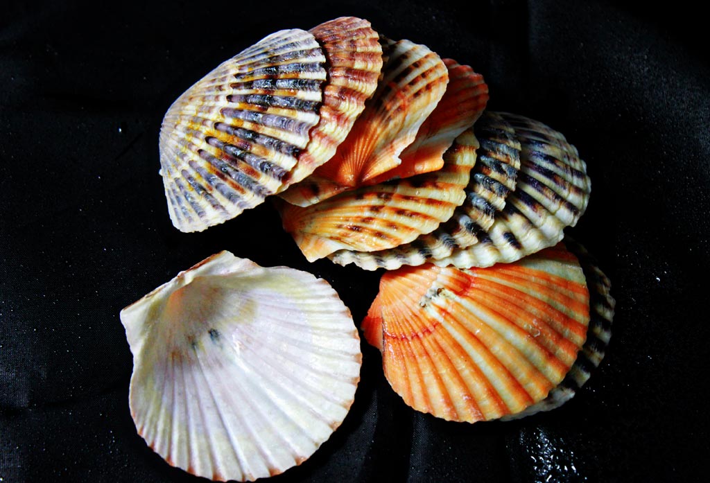
I came across this little pile of clam shells.
I have a lot to learn!
So to help with my education, if you don’t mind, which one do you like best?
I’m off to link up and be inspired by others taking this class.


i love the black plastic cloth that came with the lightbox – that’s my favorite. the items in that image look great, love the contrast that the black cloth gives. nice!
oh, also like the smudging 🙂
In the third photo I love the way the green and red pop against the black fabric and how absolutely chilly those ice cubes look. But my favorite is the fourth photo – I think I just like the simplicity of the seashells against the black background – nothing to distract me from the color, shape, and texture of the shells.
I absolutely love the second one, Miriam!
It’s wonderful.
You did really nice work. I’m not very creative with still life – hence the reason for taking the class. 🙂
My favorite is the gin and limes, but I’m awed by your ability to change the backgrounds with photoshop. I’m pretty stuck with whatever’s on hand. And, frankly, all of these have merit!
I like the first one because of the colors and textures, although I think you did a good job with all of them. I was intimidated because I don’t really take still life photos, so I only did one set up. Great job trying different things!
What a wonderful assortment. I love the tea set against that background and the arrangement of the cups. And I think those shells have lots of potential to be featured again – I love them.
Rinda
I LOVE the teapot and cups shot!
Oh my goodness, I like them all! The third one is so vibrant – would make a brilliant advert. But I am also drawn to the softness and pretty detail of your teapot …
I too like the third one: those limes are just perfect!
Oh Miriam! You definitely shouldn’t feel frustrated. What you started with and where you ended up only shows that this got your mojo going as you came up with various ideas for your backgrounds.
The background in your first image is a little “busy” BUT your objects are gorgeous, and if you’d put that same set up on a plain colored background (a coordinating solid colored towel or linen, etc.) it would be amazing! And I happen to think you DID an amazing job on ALL the other shots as well!
I think my favorite is your 2nd one, LOVE the teapot and cups!
Thanks so much for joining in, we’re headed for even MORE fun!
Gin and lime. xx
sounds super frustrating but you got some great results. I love the shells and the bottom half of the gin one – the pile of lemons and ice in the glass
Miriam, I LOVE all of your photos. I’m not all that imaginative when it comes to taking pictures. But I have to say, your gin & tonic was calling me!!!
I love the one with the brilliant yellow green lemons…they just jump!!
They are all superb, but the gin is my fave xx
I love the shells one most of all but the gin and lemon or is it lime comes in a close 2nd.
Oh, you really worked hard at this, didn’t you? Good for you! I think they all turned out well, but my favourite is the gin – great colours and I love the two pops of red. (I have been thinking about how long it’s been since I last had a gin and tonic all afternoon!) I also really like your Photoshopped background – it’s perfect for that still life.
(I haven’t got started on this yet. I don’t really have a good space to set up for shooting and I haven’t felt inspired yet! Besides, it’s warmed up here, so I can go outside now. Must take advantage of that while it lasts!)
I enjoyed the photograph of the teapot and cups the most. But I think the shot of the shells is the best photographically – if that makes sense.
I like the contrast and saturated colors of the third one. It just shouts “pop” to me!
This sounds like a terrific class, especially for you during the cold winter weather. I will be following your progress with interest.